

What a Business Website Needs to Build Trust and Generate Contacts
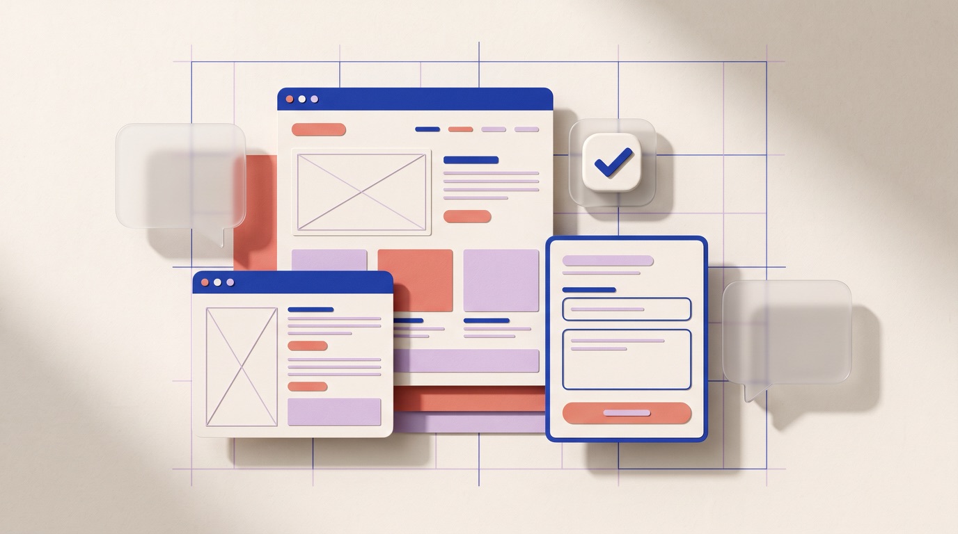
A website that builds trust and generates contacts does not need to be full of effects, long blocks of copy, or sweeping promises. It needs to help someone understand what the business does, who it is for, why it may be a good fit, and what the next step is to start a conversation.
For a business, the website may be the first place where a potential client decides whether it is worth writing, requesting a proposal, or scheduling a meeting. Its role is not to replace a sales conversation; it is to prepare it better.
1. A clear proposition at first glance
When someone arrives on a page, they should be able to answer three questions without searching too much:
- What does this business offer?
- Who is it for?
- What problem does it help solve?
A message such as “Innovative solutions to transform your business” sounds appropriate, but it does not explain anything specific. It is better to use a sentence that describes the service and the type of client in direct language.
For example, a software company could explain that it designs internal platforms to organise processes. A design studio could say that it creates websites for businesses that need to present their offer more clearly.
The main proposition does not have to explain everything. It should open the door to the important information and provide a reason to keep exploring.
2. Services explained as solutions, not as a technical list
A list of terms—UX/UI, SEO, development, branding, or automation—can show capabilities, but it does not always help a client recognise what they need.
Each service should explain:
- What situation it addresses.
- What is delivered.
- How the work is done.
- When it makes sense to hire it.
For example, a landing page may be suitable for launching a specific service, validating an offer, or centralising campaigns. A corporate website may be better when a business needs to present several service lines, its team, experience, and ways to get in touch. At AverumLabs, you can review the services we build before defining a starting point.
This clarity avoids two problems: clients arriving with the wrong expectations and businesses not receiving enquiries because their offer feels confusing.
3. Evidence that can be verified
Trust is not built through phrases such as “we are leaders” or “we guarantee results.” It is built through concrete, honest information that is easy to verify.
A website can show evidence through:
- Projects or work cases approved for publication.
- A precise explanation of the team’s role.
- Real, current screenshots of digital products.
- Authorised, attributable testimonials.
- A clear methodology and deliverables.
- Contact information and a consistent professional presence.
If a project was completed in collaboration with another company, it is worth saying so. Presenting a contribution as full ownership can create doubts when a client researches further. Explaining that the team contributed to design, development, or a specific stage shows more maturity than overstating the scope.
4. A visible process reduces uncertainty
Hiring a digital service can feel uncertain for people who do not work in technology. Many people do not know what they need to prepare, how long a project may take, or what happens after they write on WhatsApp.
A brief process section helps reduce that friction. It does not need to reveal every operational detail. It is enough to show an understandable sequence:
- We discuss the business, objective, and context.
- We define scope, priorities, and a work proposal.
- We design and build the agreed pieces.
- We review, publish, and leave a foundation to continue from.
The goal is not to promise the same formula for every project. It is to show that there is an organised way of working and that the client will not have to guess what comes next.
5. Easy contact, with a clear expectation
An interested person may leave a website if they do not know how to get in touch or if contact feels too formal. The call to action should appear at the beginning, after the services are explained, at the end of a case, and at the close of the page.
In Peru, WhatsApp can be a practical channel to start a conversation. However, the button should have a clear purpose. Instead of only saying “Contact us,” it can say “Let’s discuss your project” or “Tell us what you need to build.”
It also helps to set expectations about what to share in the first message:
- What the business does.
- What needs to be improved or launched.
- An approximate date.
- References, if available.
This improves the quality of the enquiry without forcing the visitor to complete a long form.
6. A considered mobile experience
Many visits may arrive from a phone. That is why the mobile version should not be a rushed adaptation of the desktop experience.
A trustworthy mobile website has readable text, comfortably tappable buttons, simple navigation, images that do not take longer than necessary to load, and content that keeps its hierarchy. If someone has to zoom to read, if the contact button is hidden, or if the page shifts while loading, the perception of quality decreases.
Minimal design does not mean empty design. It means every element has a reason: fewer distractions, more clarity, and better decisions.
7. Basic information that confirms the business exists
Not every business needs to publish an extensive story, but it should leave consistent signals of identity and accountability.
At a minimum, it is useful to include:
- The business or studio name.
- Main services.
- A professional contact email.
- A direct contact channel.
- Links to relevant professional profiles.
- Legal or privacy information where appropriate.
The “About us” section should speak about the way of working, the perspective, and the kind of collaboration the team seeks. It does not need to become a personal biography if the brand presents itself as a studio.
8. Keep information up to date
A website does not end when it is published. Services that are no longer offered, broken links, old screenshots, or outdated copy can have a greater effect than not having a website at all.
A regular review makes it possible to verify that links work, cases reflect current work, and the proposition remains clear. It also creates opportunities to publish guides, answer frequent questions, and build authority in a useful way.
Checklist before publishing
- The heading explains what the business does and who it is for.
- Services describe problems, deliverables, and context of use.
- Published projects have permission and clarify the team’s role.
- There is a brief, understandable work process.
- There is a visible, mobile-friendly contact action.
- Email, WhatsApp, and professional links work.
- Images load quickly and have descriptive alternative text.
- Information looks good on phone, tablet, and desktop.
- There are no unapproved promises, figures, or testimonials.
- The site has a review planned after publishing.
A website should make the next conversation easier
An effective page does not try to persuade everyone. It helps the right people understand whether there is a good opportunity to work together.
Let’s talk
Considering a website for your business?
Tell us what you need to organise, launch, or improve. We will review the context and suggest a useful next step.